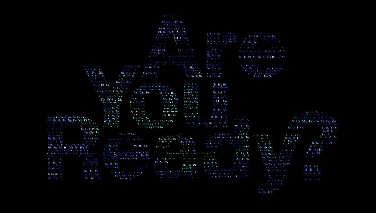
Are You Ready?
By Kim André Fladen
I made the visual identity for a web series called Are You Ready? created by artists Frans Jacobi and Gitte Sætre. The series follows a tree entering into the human society, and when attempting to understand it starts questioning how it operates.
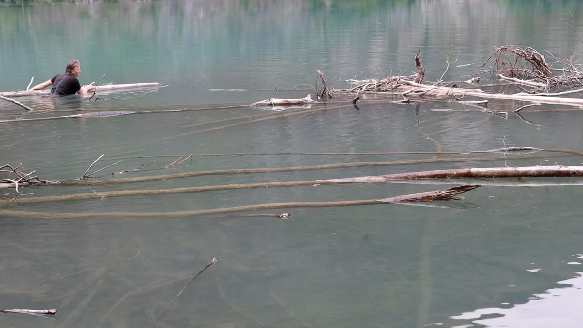
Sognefjorden is the largest and deepest fjord in Norway. If you follow Sognefjorden into the country you will eventually end up at a beautiful place called Skjolden. This is also where Austrian philosopher Ludwig Wittgenstein’s Norwegian cabin was located. Wittgenstein himself was to become one of the most impactful philosophers of the last century, but he most probably found the view of the clear water very impactful to himself. The water has an interesting aura. This water is the same water from which the protagonist enters the web series.
Research question
How can I as a designer, and part of a bigger collaboration, develop a visual identity for a web series which is a conceptual art project where I also have to take into account two experienced visual artists’ intentions and artistic character?
The process from 1 to 5
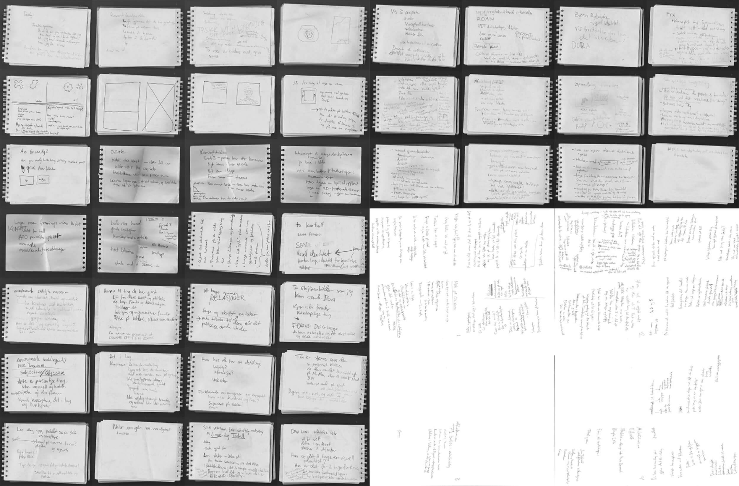
I received an introduction to the project by email a couple of days before we met at Kunsthall 3,14. There Frans and Gitte gave me more insight into what they wanted to do, and I brought up some of my initial ideas for the communication.
1 Research: Broad and deep
After the meeting, I spent the first part of my time broadly researching the aesthetics and concepts being used in the cultural sphere nowadays. Then I took a deep dive into projects the artists had done before, both together and individually. Following this I looked into the project itself—Are You Ready? This is something I had to do again and again throughout the process. During the process, I was sent visual material from the development of the web series, which was vital to understanding the visual landscape of the project. Project references like Wittgenstein and the artists’ own Climate Futuristic Manifesto also had to be researched.
Then I went out into the world again and analyzed how other people have done works in the cultural sector. From works for the Jewish Museum in New York to Stedelijk Museum, and Norwegian rapper Lars Vaular. I also picked up on insights from C/ID: Visual Identity and Branding for the Arts, a book written by design historian Emily King and edited by Pentagram’s Angus Hyland.
Following this, I looked backward in time to find ideas that related to the forms or concepts of the web series. I looked into Dadaism, Futurism, and Afrofuturism. I also invested energy into finding out which values of these art movements differed from the values of the project I was working on. Finally, I also analyzed the completely magnetizing short film Powers of Ten from 1977, and Bill Anders’ photo of the Earth from the Moon’s perspective.
2 Strategy: A team effort
When working in a team with a real project I had to adapt to the fact that we were to present this project to a real-life audience. At the same time, it isn’t always obvious exactly who you want to reach when creating contemporary art as the artists do in this project. Given some time we still managed to plot down a couple of notes on what TV shows the people in the audience probably are invested in already. And to some extent what kind of relationship they might have to nature, and environmental questions.
In all strategy work, there is an economic question to take into account. Art projects don’t usually have the wildest of marketing budgets, and neither does this one. Based on this fact, we chose that the smartest move would be to link a fair share of the design decisions we make with conventional communication of projects connected to environmentalism. We also chose that we want to test how we can use new mediums such as podcasts and TikTok to reach new audiences with art.
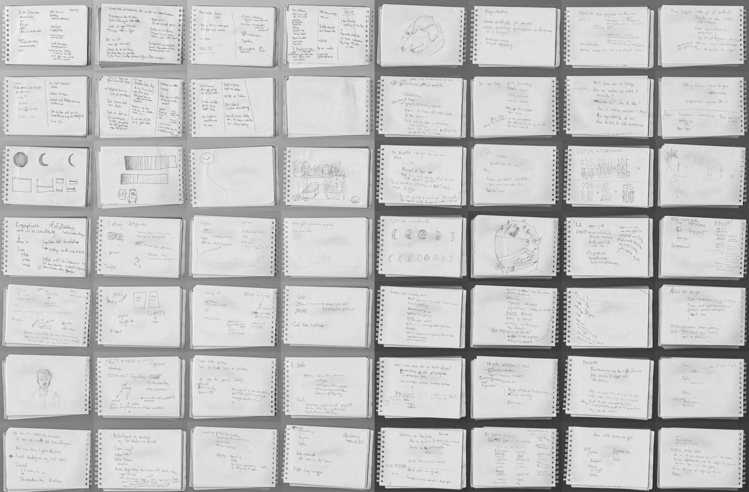
3 Direction: The rational and the spiritual
When working with the direction it became important for me to use this opportunity to develop my concepting skills. I spent a lot of time writing and sketching by both pencil and trackpad. I also had regular check-ins with the artists. Furthermore, I got feedback regularly from my main BA supervisor Johan José Odfjell, Dóra Ísleifsdóttir, and other academic staff from the school. Mario Urban Mannsåker and Synnøve Ringstad from OK Kontor were also very helpful in guiding me through this part of the process. Thanks to these people I believe my concepting skills have developed to a new level during this past semester.
My experimentations and concepts went in a lot of directions, and I am blessed for the guidance I got from the people I mentioned above. They helped me narrow it down. In the end, I decided to work from two different sets of contrasting words or themes which the web series touches upon.
The first contrast is a meeting between the logical and illogical—a meeting between the rational and the spiritual. Representing the rational I picked the typeface Latin Modern, made for the systematic and universal LaTeX project. I also chose to go for Neue Haas Grotesk, which in many people’s eyes is almost the very definition of Modernism. Representing the more spiritual, or mystical, side of the project are the random placements and the play with words and scientific terms. I also try to push the software and screen I use unto its bugs and limits. Out comes pixels which shouldn’t appear and sounds that fit even though they don’t really do.
Secondly the contrasting words micro and macro also encompass many sides of the project. The world has many layers, and they often relate. Changes happening on a micro level will often shift how things work on a macro level, and vice versa. These kinds of connections are underlying throughout the series. In the title sequence for the series, I have tried to expose these connections by using the same kind of system to display different types of layers.
4 Touchpoints: The end result in mind
As my fourth step, I had to be aware of what I should turn my chosen design direction into. To reach people in a professional way it is crucial to know where the visual identity is going to appear. That is partly why it was important for me to know that the identity primarily will be shown in a digital form. This lets me play with digital tools far more than what would be reasonable if it was to be printed on paper. Then I would maybe spend more of the time testing the printer I would use, and different types of paper.
It was also good to know what kind of online platforms would be used to connect with people. I have one example. The organic reach for content on TikTok is far better than on Instagram, and there is a high probability that your content will be seen by people that don’t know you from before. Also, most of the videos are looking like they were taped right onto people’s smartphones. This combination of insights implies a couple of things for projects like this.
First of all, a lot of people will see the project’s videos without knowing the web series beforehand. This means we have just a quick moment or two to convince people that this content is worth their time. Therefore our videos can’t look like advertisements when everyone else’s videos are straight from the phone. If we filled our content with all of that nice screen-based graphic design people would scroll past it at once. To build a successful TikTok account, the content must be far less visually branded than it can be on Instagram. A straightforward logo profile picture might hurt the communication of the project more than a casual outside photo. At least for now.
5 Assets: Making it easy
As I am still working on this I can just briefly touch upon the importance of making the designed assets easy to use for the artists. I have tried to create as finished files as I can and getting the control to upload things myself. In this way, I am making sure that it works, and the artists can focus more of their time on what they want to do. It will also be important for me to make the files accessible afterward in a functional folder system. I guess this is where the more structured part of me will be appreciated.
More visuals
As I can’t reveal all the visuals until the project is released I am encouraging you to follow the project wherever you happen to spend your time online. During the next months, the tree will be active on Twitter, Instagram, YouTube, and TikTok. You can also follow what’s up over at areyouready.tv
Kim André Fladen (NO)
For the last three years, I have been belonging to KMD, UiB. Thanks to my beautiful classmates and the academic staff it has been a time with great amounts of happiness. A lot of these people care, and I have just been lucky to end up exactly here. In addition to spending my bachelor time in Bergen, I have also spent three months interning at Overpriced in Riga, Latvia. There I was learning branding design from Aigars Mamis and the other lovely couple of people in and around the studio. During the following semester, I also spent valuable time in the department of design at LMA—Art Academy of Latvia. The semester there was packed with type, info design, and startup courses. Now I am wrapping up my semester in this exhibition before pursuing my master’s degree at KMD.